A quick overview
envisioning an online community
Designing an online community for a TV pilot streaming service isn’t much of a reach: this medium has a long, rich history with enthusiastic viewers coming together to share their love for their favorite programs. When Pilot.ly approached us with the intention of creating a space devoted to people who love TV, it was meant to be. I love watching how people share & interact with entertainment content, especially exclusive content that no one has seen!
It became my job to discover how to best entice fans to use Pilotly’s streaming service and encourage feedback between fans and the Pilot.ly video player.

talking to users focus-group style
I’ll be the first to admit that I’m not a fan of focus groups (feel free to ask why). Despite my feelings, after deliberation, we realized that we could leverage this technique with our target audience. Not only were we able to get feedback about their streaming behavior and attitudes towards entertainment, but I was able to witness firsthand how this set of strangers interacted with each other over TV. If we were to facilitate interaction with other fans online, we needed to witness how strangers in real-time could connect over entertainment. Only then could we reflect those findings into our digital solution.
For 2 hours, we chatted with a mix of TV watchers who expressed ranging interest in personal profiles, social media, sign-up processes, commenting and rating systems, and recommendation systems.
building a robust profile
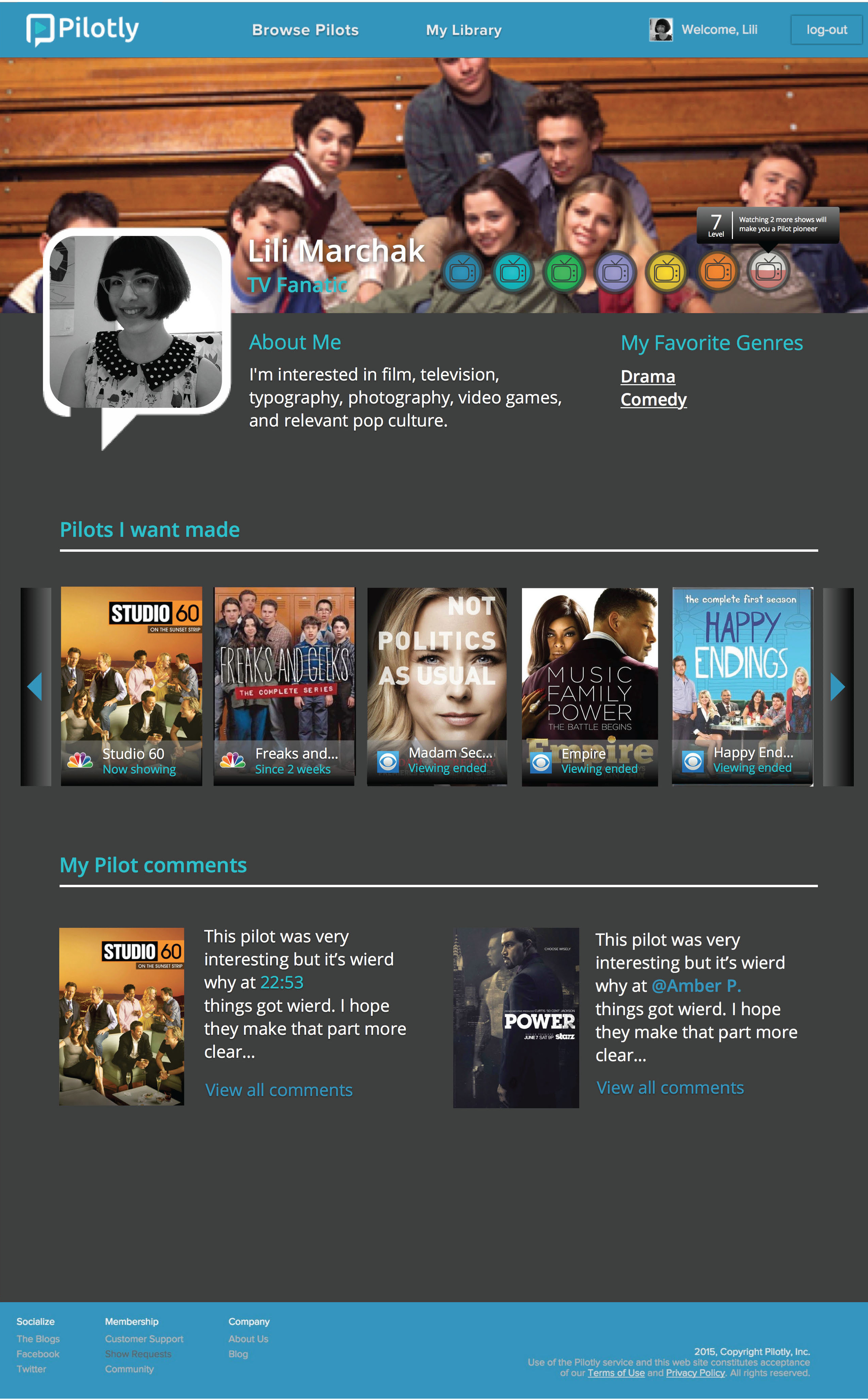
One of the most essential solutions for an online community that we provided was user access to a personal profile. Throughout our research, we discovered that TV fans feel the need to express their identity and expertise on specific subjects. It builds a sense of commitment and sense-of-self when people can invest time/energy into something digital (or physical). Once a user builds their own profile, that person can explore other created profiles. This creates a connection not only to other fans, but to the system: this is what Pilot.ly required most in order to retain users on their website.
getting a reputation
Not only could users customize their profile, but this space also reflects that person’s system reputation on the website. We decided that users can earn between 1 and 7 levels (with titles from “New Kid on the Block” to “Pilot Pioneer”). Each level has different types of extrinsic rewards and is earned by a mix of commenting, watching, and interacting with TV pilot content/pilot fans.


giving feedback on your favorite shows
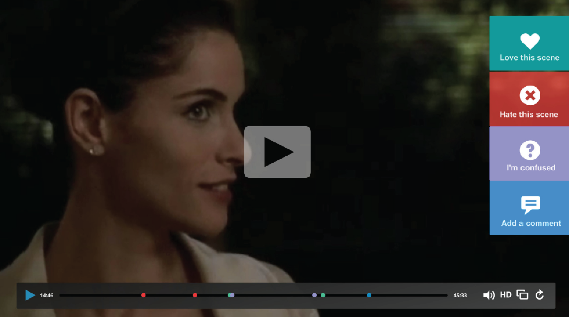
One of the most exciting ideas that I conceptualized was a momentary feedback system. We wanted community members to exchange comments, likes, and dislikes about TV pilots with each other while generating rich content for Pilot.ly to interpret for their clients. To do this, we devised a feedback system inspired by SoundCloud. While watching a pilot, users could press a button to mark moments in the video that they liked, disliked, and wanted to comment on. Anyone else watching that pilot could see parts that were generated by other community members. To my excitement, Pilot.ly took our suggestion and implemented in their current features. To see this in action, sign-up and watch a pilot at Pilot.ly.
animating a whiteboard video
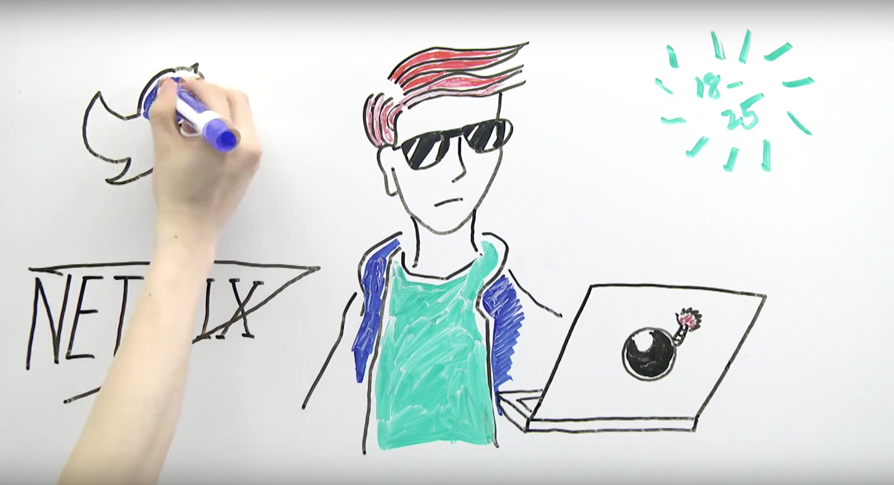
To showcase our work, the team decided that a whiteboard video was a clever, creative way to present our findings. While that was all well and good, we ultimately had to ask ourselves, “How can we get this done in such a short amount of time?”
Relying on the skills that I acquired in undergrad, I was able to help write a solid script in a day, storyboard our drawings in a few short hours, and manage a rigorous schedule for filming. With the help of one of my teammates, I set up the equipment, directed talent, single-handedly edited the final video project, and starred as narrator.
The client appreciated all the work we invested into this project and we received plenty of compliments. The entire video was shot and edited within ~2 days.

